Thumbnail Maker - Channel Art
- 4.8
- Rating
- 5.00M
- Installs
- Free
- Price
 Analysis by App-foxy
I first approached Thumbnail Maker - Channel Art as a quick utility rather than a full design studio. That turned out to be the right expectation. This free Art & Design app is built for making attention-grabbing thumbnails and channel graphics without asking me to understand layers, typography theory, or complicated editing controls. After spending time with it, I see its main appeal clearly: it shortens the distance between an idea and a usable image.
The app comes from Maxlabs Graphic Design Tools, and its focus is deliberately narrow. I would not choose it to replace a complete editor for detailed illustration, branding systems, or advanced photo manipulation. I would choose it when I need a polished visual quickly, especially for a video, social post, channel update, or small promotional project. That focused approach makes it approachable, although it also creates limits that become more noticeable as a project grows.
How Thumbnail Maker - Channel Art feels in everyday use
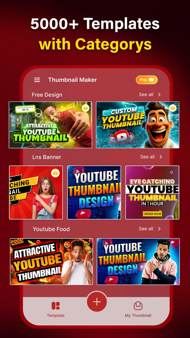
The first thing I noticed is that the app is organized around starting points rather than a blank canvas. That matters on a phone because beginning with an empty workspace can be surprisingly slow. A ready-made composition gives me a visual direction, then I can adjust the main elements instead of spending the first several minutes deciding where everything should go.
You May Also Like

 Blood Strike: 2.5 Anniversary
Blood Strike’s Loadouts Turn Every Drop Into a Tactical Gamble
A close look at Blood Strike’s custom loadouts: how fast access to signature weapons reshapes its battle royale rhythm, rewards preparation, and narrows the gap between fights.

 Pandora - Music & Podcasts
Pandora’s Music Is Easy to Start, but Harder to Recover
Pandora’s strength is its low-effort path from a seed to a station. Its weak spot is how much confidence it asks you to place in connection, setup, and quiet recovery.

 8 Ball Pool
 Is Built on Rivalries, Rematches, and Routine
A close look at the rivalries, rematches, shared routines, and unanswered safety questions that turn a quick pool match into a persistent mobile community.

 Samsung Music
’s Quiet Strength Is Playing What You Already Own
Its reach comes less from spectacle than from dependable access to a personal library. That simplicity is both the app’s strongest retention engine and its ceiling.

 AccuWeather: Weather Radar
AccuWeather Review: A Quick, Clear Forecast for Everyday Decisions
For everyday plans, the best forecast is the one you can understand quickly. AccuWeather makes rain timing, radar, and local conditions easy to act on, with a few trade-offs.

 Hill Climb Racing
Why Hill Climb Racing Still Turns Crashes Into One More Run
A tiny car, a bumpy hill and one more upgrade: Hill Climb Racing keeps resurfacing because its simple chaos makes every near-miss feel personal.
More From Our News Desk



For a typical thumbnail, my workflow is simple: choose a suitable starting design, replace the prominent image or text, adjust the visual balance, and check the result at a small size. That last step is important. A design can look attractive when it fills the phone screen but lose its message when reduced to the size people actually see in a feed. I found the app most useful when I treated clarity as more important than decoration.
The controls are aimed at people who want visible results without a design course. I can make practical changes without feeling that every adjustment risks breaking the whole composition. That is a genuine strength for beginners, students, casual creators, and anyone preparing content between other tasks. The trade-off is that experienced designers may find the workflow less open-ended than a professional editor.
One realistic use case is a creator who finishes a video during a lunch break and needs a thumbnail before publishing. Instead of opening a desktop design program, searching for a suitable canvas, and building a layout from scratch, the creator can use a prepared composition and concentrate on the title, image choice, and contrast. For that situation, speed is not a minor convenience; it is the reason to use this app.
Where the templates help, and where they do not
Templates are most valuable when I already know the purpose of the image. A tutorial thumbnail, a reaction video cover, and a channel announcement each need a different visual emphasis. Starting with a related layout helps me avoid the common beginner mistake of giving every word and picture equal importance.
However, a template should be treated as a framework, not as a finished answer. If I leave every element untouched, the result can feel familiar rather than personal. My better results came from changing the most visible parts first: the main photograph, the headline, the color emphasis, and the amount of empty space around the subject. Small edits can make a preset feel much less generic.
I also recommend checking text at a distance before exporting. On a phone, it is easy to admire a stylish font while overlooking the fact that the actual message is difficult to read. Short titles work better here than long explanations. If the idea needs a sentence or several supporting points, I would move to a more flexible editor instead of forcing the thumbnail to carry too much information.
Useful workflows beyond a single video cover
Although the name points strongly toward thumbnails and channel art, I found the same basic workflow useful for other visual tasks. A simple announcement graphic, a cover image for a recurring series, or a promotional post can benefit from a prepared composition. The app is especially practical when I need a consistent visual direction but do not need a complete brand identity system.
For recurring content, I would create a small personal routine rather than redesigning everything every time. I would keep the same general placement for the title, use a recognizable color approach, and change only the subject image and wording. This gives a channel or project a more coherent appearance while still allowing each graphic to reflect its individual topic.
Another useful habit is to make the thumbnail after deciding on the central promise of the content. If I cannot express the video in a few strong words, changing fonts will not solve the problem. The app can arrange the message, but it cannot decide whether that message is clear or interesting. In my experience, the quality of the result depends as much on editing the wording as on choosing the visual design.
What the current version means for new and existing users
The current version is 1.11.2, and the app has been available since September 27, 2019. I read that history as a sign of an established utility rather than a brand-new experiment. It has had time to settle into its purpose, which is reassuring for someone who wants a straightforward thumbnail tool instead of a constantly changing creative platform.
For a new user, that maturity makes the app easy to evaluate: the core question is whether a template-led mobile workflow matches your needs. For an existing user, the practical benefit is continuity. If you already understand the general editing approach, moving into the current version should feel like continuing with a familiar tool rather than learning an entirely different product.
I would still avoid assuming that an established version automatically makes the app suitable for every project. A mature, focused editor can remain intentionally simpler than a professional design suite. Its value comes from reducing decisions, not from offering every possible control. That distinction is important if you are moving from casual graphics into detailed commercial work.
The app is free to install, which makes trying it low-risk. It also includes in-app purchases ranging from around five dollars to around forty dollars per item. I would look carefully at what is available before building a workflow around premium material. The free starting point is useful for testing the editing experience, while the optional purchases may matter more to someone who wants a broader collection of design resources.
How it compares with the usual alternatives
Compared with a general-purpose mobile editor, Thumbnail Maker - Channel Art feels faster at the beginning because it is already oriented toward a specific visual outcome. A broad editor may offer more freedom, but that freedom can mean more setup. If my priority is producing a readable thumbnail quickly, I prefer the focused route.
Compared with desktop design software, the app is easier to pick up but less appropriate for precision-heavy work. Desktop tools are better when I need detailed alignment, complex compositing, reusable brand assets, or careful control over every object. I would not switch to this app for a large identity project or a design that will be revised by several people.
Compared with making a graphic from scratch in a blank-canvas app, the main advantage is decision support. I do not have to invent the entire structure before I can see something useful. The downside is that the starting layouts can influence the final look. If originality and complete control matter more than speed, a blank canvas remains the better choice.
In other words, this app sits between a basic social graphic maker and a full design suite. It is more purposeful than a generic editor, but it is not trying to be a professional production environment. That middle position is why I can recommend it confidently for quick channel visuals while being more cautious about advanced users.
Small decisions that noticeably improve the result
My first practical tip is to judge the design as a tiny image, not as a poster. I would zoom out or hold the phone farther away and ask whether the subject and title are still obvious. If they are not, I would remove secondary wording before adding more effects. A clean, readable thumbnail usually serves its purpose better than a crowded one.
Second, I would choose the image before fine-tuning the typography. The main photograph determines where the empty space is, and that empty space determines where the title can sit comfortably. Trying to preserve a layout after choosing a poorly framed image often creates unnecessary adjustments. It is quicker to select a picture that naturally supports the composition.
Third, I would keep a distinction between the thumbnail and the channel art. A thumbnail has to communicate a single piece of content quickly, while channel art represents a broader identity and may be viewed in different contexts. Reusing the exact same design logic for both can make the channel look repetitive or leave important information poorly placed.
Fourth, I would save a clean version before experimenting with more dramatic changes. This is a simple habit, but it reduces the frustration of trying to reconstruct a layout that already worked. It also lets me compare a restrained version with a louder one before deciding which communicates better.
Finally, I would avoid treating every available visual element as necessary. Decorative additions can make a design feel busier without making it more informative. The app makes experimentation easy enough, but restraint still has to come from the person using it. That is one of the clearest differences between a usable graphic and a merely decorated one.
Remaining gaps and the users who should choose something else
The biggest limitation is the same feature that makes the app approachable: its focused, preset-driven nature. I can move quickly when my goal fits the intended format, but I have less reason to choose it when I need a completely original composition. Users who work with detailed illustrations, intricate photo edits, or strict brand guidelines may outgrow it quickly.
I would also hesitate to recommend it to someone who wants one app for every kind of design project. A thumbnail specialist does not need the same toolset as a person preparing print material, interface mockups, or layered campaign assets. In those situations, a more comprehensive editor is worth the extra learning time.
The purchase structure is another point to consider. Because the app is free to start but offers individual in-app purchases from around five dollars up to around forty dollars, I would decide in advance how much I am willing to spend. Casual users may be perfectly satisfied with a limited workflow, while frequent creators should assess whether the available paid material fits their recurring needs before committing.
There is also a creative limitation that is harder to measure: using prepared designs can make it tempting to follow the visual habits built into the app. That is not a problem for a quick personal project, but it matters if every upload needs to look distinctive. I would use the app as a starting point and develop my own rules for color, wording, and image selection rather than relying on presets to create a complete identity.
What I would watch as the app continues
For future use, I would pay attention to how the app balances convenience with creative control. The most valuable improvements would be the ones that preserve the quick workflow while giving experienced users more room to personalize a design. More flexibility is useful only if it does not turn a simple thumbnail task into a complicated editing session.
I would also watch how well the app serves people who have already built a library of recurring content. The beginner experience is easy to understand, but long-term value depends on whether regular creators can maintain consistency without producing graphics that all look alike. Efficient reuse and meaningful customization need to work together.
Its audience is already substantial, with over a million installs, and the app holds a 4.7 average from around fifty-one thousand ratings. Those figures suggest that the focused concept has connected with many users, but they do not change my advice: popularity is less important than whether you need speed or control. I would choose it for the former.
The Everyone age rating also makes it a comfortable option for a broad range of casual creators. That does not mean every project will suit the app, but it reinforces the sense that the tool is designed for accessible, everyday visual work rather than a specialized professional niche.
My final recommendation is straightforward. Choose this app when you need a clear, attractive thumbnail without spending time learning a full design system. I found it especially useful for quick publishing, repeatable channel graphics, and people who want guidance at the start of the design process. I would skip it for complex branding, detailed illustration, or work demanding exact control over every element.
For the right user, Thumbnail Maker - Channel Art is a practical shortcut rather than a replacement for serious design software. Its best quality is not that it can do everything; it is that it helps me finish one specific visual job with less friction. If that is the job in front of you, the free starting point makes it worth trying, while the optional purchases are something to consider only after the basic workflow genuinely fits your routine.
FAQs for Thumbnail Maker - Channel Art
01What features does Thumbnail Maker - Channel Art offer?
Thumbnail Maker - Channel Art provides users with a range of tools to create professional-grade thumbnails and channel art. It includes customizable templates, a vast library of fonts and stickers, and options to add images and text. The app also offers advanced editing features such as layering, resizing, and color adjustments.
02Is Thumbnail Maker - Channel Art user-friendly for beginners?
Yes, Thumbnail Maker - Channel Art is designed with a user-friendly interface, making it accessible for beginners. The app offers easy-to-follow tutorials and intuitive controls that guide users through the process of creating eye-catching thumbnails and channel art, even if they have no prior design experience.
03Does the app require an internet connection to function?
While an internet connection is needed for initial download and updates, Thumbnail Maker - Channel Art allows users to create and edit thumbnails offline. However, accessing certain features like downloading new templates or cloud storage might require being online.
04Are there any in-app purchases or subscription fees?
Thumbnail Maker - Channel Art is free to download, but it offers in-app purchases for premium features. Users can opt for a subscription to unlock additional templates, remove ads, and access exclusive design elements. It's important to review these options to understand potential costs.
05Can I use Thumbnail Maker - Channel Art for commercial purposes?
Yes, users can create thumbnails and channel art for commercial purposes using Thumbnail Maker - Channel Art. The app provides a commercial use license, allowing content creators to design elements for their YouTube channels or social media platforms without copyright concerns. Always check the app’s terms for detailed licensing information.
Pros
- User-friendly interface for quick edits.
- Wide variety of templates for customization.
- High-resolution output suitable for all platforms.
- Regular updates with new features.
- Supports multiple formats for export.
Cons
- Some features require in-app purchases.
- Occasional ads can interrupt workflow.
- Limited font options in the free version.
- Requires internet for most features.
- No direct social media sharing integration.

Thumbnail Maker - Channel Art
Gallery